


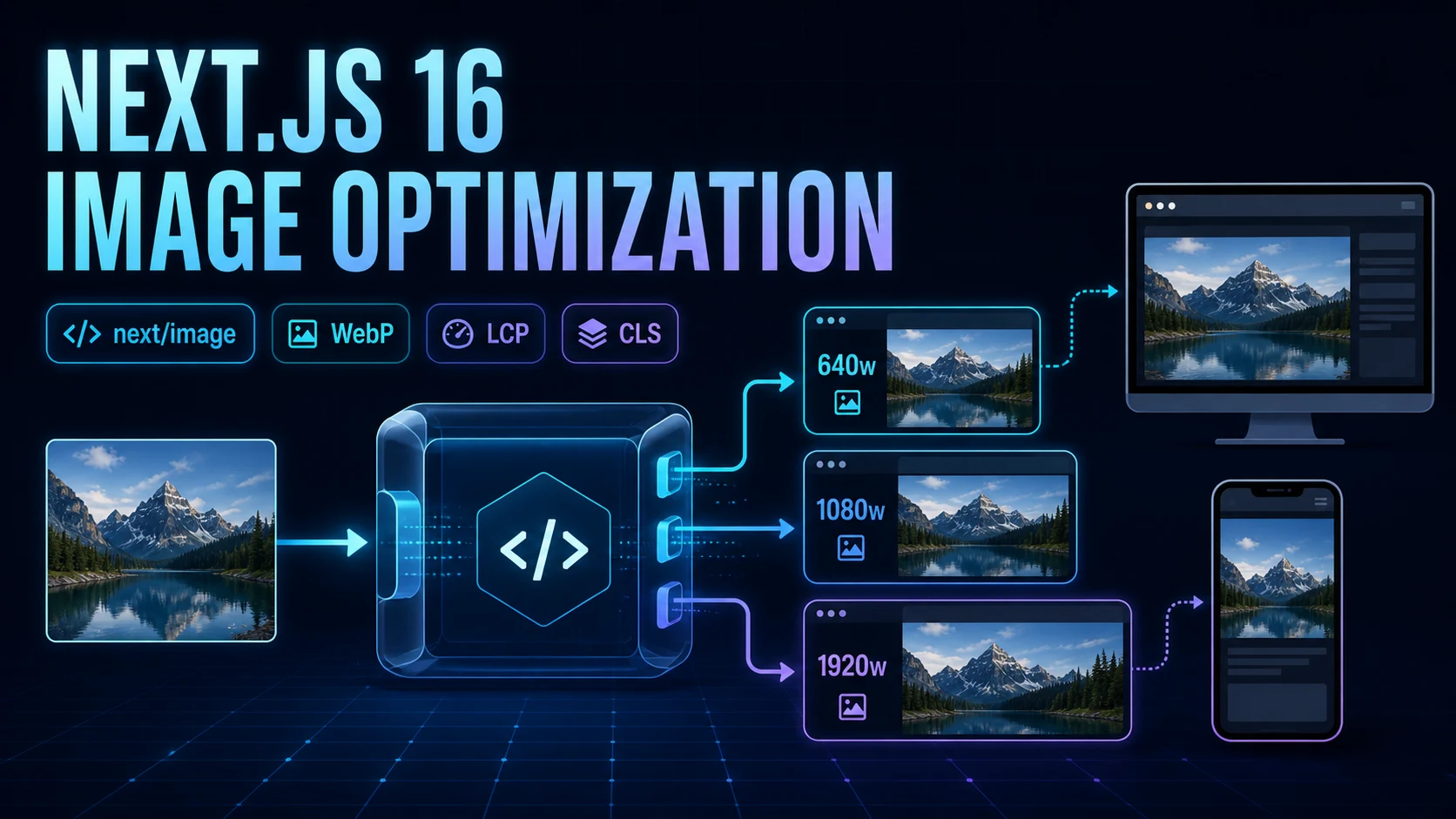
In Blog #11, we configured metadata and social previews. Now we will optimize the images users actually download. Images are often among a page's largest resources; a poor implementation can delay LCP, cause CLS, waste mobile data, reduce visual quality, and hide meaning from assistive technology.
This guide covers local and remote sources, intrinsic dimensions, fill, responsive sizes, hero loading, placeholders, formats, quality, secure configuration, a responsive gallery, and the image-related defaults that changed in Next.js 16.
Image Optimization at a Glance
The Image component extends HTML img. With the default loader, a request can be resized to a permitted width and quality, encoded in a browser-supported format, cached, and delivered through generated srcset URLs. Lazy loading and reserved aspect ratio improve browser behavior. The exact result depends on configuration, loader, deployment, browser support, and whether optimization is disabled.
The downloadable starter declares "next": "latest" without a lockfile or installed dependency tree, so an exact patch cannot be verified. The examples follow the current official Next.js 16 documentation. Pin production dependencies and commit a lockfile.
- Source image
- Pattern check
- Resize + quality
- WebP / AVIF
- Image cache
- Browser picks
Why Image Optimization Matters
Sending a 2400px image into a 360px card costs bandwidth and decoding work without adding visible detail. Omitting intrinsic dimensions can make content jump after loading. Loading every gallery image immediately competes with CSS, fonts, and the likely LCP image. Optimization is therefore a system: select a sensible source, expose efficient candidates, describe the layout truthfully, choose loading priority, and measure the outcome.
| Problem | Useful tool | Measure |
|---|---|---|
| Oversized download | sizes + generated srcset | Transferred bytes |
| Layout jump | Intrinsic ratio or sized fill parent | CLS |
| Late hero discovery | One deliberate loading strategy | LCP request timing |
| Unsafe remote fetch | Narrow remotePatterns | Allowed request surface |
What Is next/image?
Use Image for content images that benefit from resizing, format conversion, responsive candidates, and layout stability. It works in Server Components and does not itself require a client boundary; review Server and Client Components before moving surrounding UI client-side. A normal img remains appropriate when you intentionally need direct browser behavior, a data URL, unusual authentication, or an image pipeline outside Next.js. The default optimizer does not forward request headers when fetching a remote source, so authenticated images need a different design or unoptimized after a security review.
import Image from 'next/image'

export default function GuideCover() {
  return (
    <Image
      src="/assets/images/blog/nextjs-image-optimization/nextjs-16-image-optimization.webp"
      alt="Responsive image variants produced from one source"
      width={1672}
      height={941}
    />
  )
}
The path above points to this article's real production asset. In a Next.js application it would live under public/assets/images/... and be requested without the public segment.
Local Images and Static Imports
A string source from public needs explicit width and height. A static import lets Next.js read dimensions at build time and automatically provides blur data for static JPG, PNG, WebP, and AVIF files unless the file is animated.
import Image from 'next/image'
import cover from '@/public/images/guide-cover.webp'

export default function Cover() {
  return <Image src={cover} alt="Image optimization flow" placeholder="blur" />
}
Static imports make accidental aspect-ratio mistakes harder and use content-hashed immutable caching. String sources are useful for content records and known public paths. For local URLs with query strings, Next.js 16 requires a matching images.localPatterns.search rule.
Width, Height, and Layout Stability
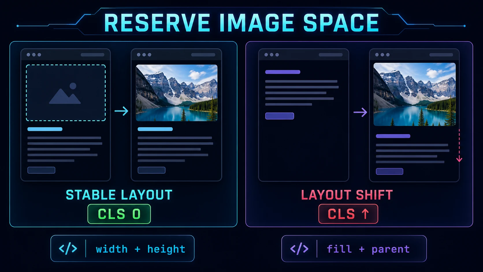
width and height describe intrinsic pixels and give the browser an aspect ratio for reserving space. They do not force the rendered CSS dimensions. When CSS changes width, preserve the ratio with height: auto. Do not enter convenient numbers that distort the source ratio.
<Image
  src="/images/case-study.webp"
  alt="Analytics dashboard on a laptop"
  width={1200}
  height={675}
  style={{ width: '100%', height: 'auto' }}
/>
Responsive Images and sizes
CSS decides how wide an image looks; sizes tells the browser that expected layout width. When an image is responsive or uses fill, an accurate sizes string lets the browser select an efficient width from Next.js's generated srcset. Without it, the browser assumes 100vw, which can download unnecessarily large files.
<Image
  src="/images/project.webp"
  alt="Project dashboard overview"
  width={1200}
  height={800}
  sizes="(max-width: 767px) 100vw, (max-width: 1199px) 50vw, 33vw"
  style={{ width: '100%', height: 'auto' }}
/>
Read the conditions from left to right: a card is almost viewport-wide on phones, half the viewport on medium layouts, and roughly one third on large layouts. Match the real CSS columns and account for gutters. With sizes, Next.js produces width descriptors such as 640w; without it, fixed-size images get a limited density-oriented set.
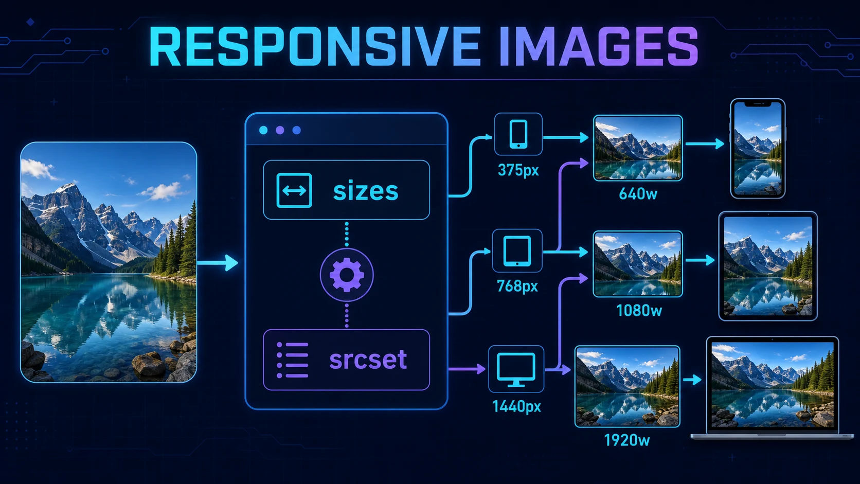
sizes string supplies the missing layout information.sizes drives candidate selectionViewport conditions estimate rendered width, then browser density influences the best available srcset candidate.Using fill
Use fill when the container controls geometry or remote dimensions are not convenient. The image becomes absolutely positioned. Its parent needs position: relative (or another positioning context), a real height or aspect ratio, and usually overflow clipping. This parent-child behavior fits the nested UI patterns from the layouts and pages guide. Add sizes; otherwise a small card may fetch a viewport-wide candidate.
<figure className={styles.media}>
  <Image
    src="/images/team.webp"
    alt="Development team reviewing an interface"
    fill
    sizes="(max-width: 767px) 100vw, 50vw"
    style={{ objectFit: 'cover' }}
  />
</figure>

/* media.module.css */
.media { position: relative; aspect-ratio: 16 / 9; overflow: hidden; }cover fills the box and may crop edges. contain preserves the entire image and may leave empty space. Choose based on content: a decorative card crop can use cover; a product diagram whose edges matter often needs contain.
Hero Images, Loading, and Preload
Images default to native lazy loading, which is correct for below-the-fold content. A likely above-the-fold LCP hero should not wait for the lazy-load threshold. Next.js 16 introduces preload and deprecates priority. Preload inserts a head link and should be reserved for a stable, high-confidence LCP image.
<Image
  src="/images/home-hero.webp"
  alt="Cloud dashboard showing regional service health"
  width={1600}
  height={900}
  sizes="100vw"
  preload
/>
Do not combine preload with loading or fetchPriority. The current docs say loading="eager" or fetchPriority="high" is preferable in many cases; use one strategy based on discovery and measurement. Avoid preloading several images that might become LCP at different breakpoints, because they compete for bandwidth.
Blur Placeholders
A blur placeholder improves perceived continuity; it does not reduce the full download. Static JPG, PNG, WebP, and AVIF imports receive automatic blur data unless animated. Remote or dynamic string sources need a tiny blurDataURL supplied manually. Keep it very small—the component enlarges and blurs it.
<Image
  src={photo.url}
  alt={photo.alt}
  width={1200}
  height={800}
  placeholder="blur"
  blurDataURL={photo.tinyPlaceholder}
/>Remote Images and remotePatterns
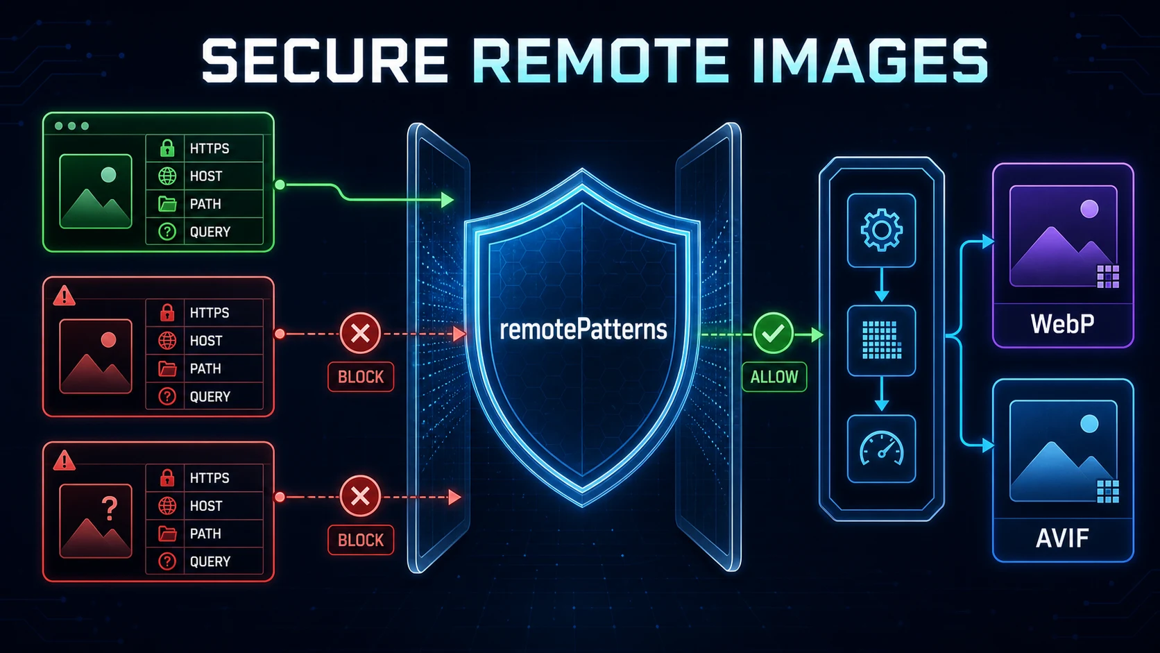
Remote URLs must be allowlisted when the default optimizer is used. Provide dimensions because Next.js cannot inspect arbitrary remote files during the build. Be specific: the rule can match protocol, hostname, port, pathname, and query string. A mismatch returns 400 instead of quietly fetching the resource.
import type { NextConfig } from 'next'

const nextConfig: NextConfig = {
  images: {
    remotePatterns: [{
      protocol: 'https',
      hostname: 'navtechsolution.com',
      port: '',
      pathname: '/assets/images/**',
      search: '',
    }],
  },
}

export default nextConfig
This uses the site's real production host and restricts paths to the existing image directory with no query string. Omitting fields implies broad wildcards and is not recommended. * matches one segment; ** matches trailing path segments or leading subdomains. The older images.domains option is deprecated because it cannot constrain protocol, port, path, or query.
Quality, WebP, and AVIF
quality accepts 1–100, but higher is not automatically better. It can enlarge an already poor source without recovering detail. In Next.js 16, permitted values come from images.qualities, whose default is [75]. A component value is coerced to the closest permitted quality; a direct optimizer API request with a disallowed value returns 400.
const nextConfig: NextConfig = {
  images: {
    qualities: [60, 75, 85],
    formats: ['image/avif', 'image/webp'],
  },
}
WebP is the default and remains the general recommendation. AVIF can be roughly 20% smaller but takes roughly 50% longer to encode according to the official documentation. Each negotiated format adds a separately cached variant. When self-hosting behind a CDN or proxy, forward the browser's Accept header so format negotiation works.
What Changed for Images in Next.js 16?
| Change | Next.js 16 behavior | Action |
|---|---|---|
preload | Added; priority deprecated | Migrate intentional LCP cases |
qualities | Default allowlist is [75] | Add only qualities you use |
minimumCacheTTL | Default 60 seconds → 14,400 seconds | Review freshness and cache cost |
imageSizes | 16 removed; defaults start at 32 | Add 16 only if truly required |
maximumRedirects | Unlimited → maximum 3 | Fix long chains or set a safe limit |
| Local query strings | Require matching localPatterns.search | Allow exact expected queries |
| Local IP fetching | Blocked by default | Keep dangerouslyAllowLocalIP: false |
These are confirmed changes in the current version 16 upgrade guide and Image API reference. Do not copy old tutorials that set priority everywhere or assume arbitrary qualities remain available.
Image Configuration Without Overconfiguration
const nextConfig: NextConfig = {
  images: {
    localPatterns: [{ pathname: '/assets/images/**', search: '' }],
    remotePatterns: [new URL('https://navtechsolution.com/assets/images/**')],
    qualities: [75, 85],
    formats: ['image/webp'],
    minimumCacheTTL: 14400,
    maximumRedirects: 3,
    dangerouslyAllowLocalIP: false,
  },
}
Defaults are often sufficient. Only change deviceSizes and imageSizes when real layouts and request data justify a smaller candidate set. imageSizes should remain below the smallest deviceSizes value. The optimized cache uses whichever is larger: minimumCacheTTL or the upstream image's cache max-age. This optimizer cache is distinct from the application data model explained in Caching and Revalidation. There is no per-image cache invalidation, so prefer content-hashed static imports or change the source URL when immutable content changes.
SVG, Animated Images, unoptimized, and Loaders
Next.js does not optimize SVG by default. A known .svg source is automatically unoptimized because vectors scale losslessly and can contain active content. If an exceptional design enables dangerouslyAllowSVG, pair it with contentDispositionType: 'attachment' and a restrictive image CSP such as default-src 'self'; script-src 'none'; sandbox;.
Animated images should generally remain unoptimized so animation is preserved. Use unoptimized intentionally for SVG, animated media, authenticated resources, or an external pipeline—not to conceal a bad remotePatterns rule. A custom loader or loaderFile can map src, width, and quality into a trusted CDN URL. With static export, use a compatible external loader or disable optimization because the built-in on-demand endpoint needs a server.
Image Accessibility and SEO
Write alt text for the image's purpose in context, not its file contents or target keyword list. A linked image should describe the link destination; a chart should communicate its conclusion in nearby text; a decorative image should use alt="". Do not repeat an adjacent caption word for word. SEO follows the same honesty: meaningful filenames, nearby relevant copy, stable public image URLs, accurate social dimensions, and consistent metadata and Open Graph images.
Images and Core Web Vitals
- LCP: right-size the likely largest visual, make it discoverable, avoid unnecessary lazy loading, and prevent other preloads from competing.
- CLS: reserve the correct aspect ratio with dimensions or a stable fill parent; test responsive crops and late CSS.
- INP: image optimization does not directly solve interaction latency, but oversized decoding and main-thread work can add contention during interaction.
- Source
- sizes + format
- Bytes + decode
- Paint timing
- LCP + CLS
- User experience
Build an Optimized Responsive Gallery
import Image from 'next/image'
import styles from './gallery.module.css'

const projects = [
  { src: '/images/work/commerce.webp', alt: 'Commerce product grid' },
  { src: '/images/work/analytics.webp', alt: 'Analytics trend dashboard' },
  { src: '/images/work/support.webp', alt: 'Support queue interface' },
]

export default function WorkPage() {
  return (
    <ul className={styles.gallery}>
      {projects.map((project) => (
        <li key={project.src}>
          <div className={styles.media}>
            <Image src={project.src} alt={project.alt} fill
              sizes="(max-width: 639px) 100vw, (max-width: 1023px) 50vw, 33vw"
              style={{ objectFit: 'cover' }} />
          </div>
        </li>
      ))}
    </ul>
  )
}.gallery { display: grid; grid-template-columns: repeat(3, 1fr); gap: 1.25rem; }
.media { position: relative; aspect-ratio: 4 / 3; overflow: hidden; border-radius: 1rem; }
@media (max-width: 1023px) { .gallery { grid-template-columns: repeat(2, 1fr); } }
@media (max-width: 639px) { .gallery { grid-template-columns: 1fr; } }The CSS and sizes agree at every breakpoint. Each card has a stable 4:3 box, below-the-fold images remain lazy, alt text describes visible content, and no image receives hero priority. Fetch project data in a Server Component as described in the data-fetching guide; Image itself does not require a Client Component.
Common Next.js Image Optimization Mistakes
- Using
imgeverywhere without considering responsive optimization. - Missing, duplicated, or keyword-stuffed alt text.
- Supplying a width-to-height ratio that does not match the source.
- Using
fillwithout a positioned, sized parent. - Using responsive CSS or
fillwithout accuratesizes. - Preloading every image or lazy-loading the likely LCP hero.
- Starting with enormous source files and setting quality to 100.
- Allowing broad remote hosts, paths, query strings, redirects, or local IPs.
- Using
unoptimizedto hide configuration errors. - Publishing broken OG image URLs or CSS background images for important content.
- Copying old tutorials that recommend deprecated
priority.
Best Practices and Performance Testing
- Use accurate dimensions or an intentionally sized fill parent.
- Make
sizesmirror real CSS breakpoints and columns. - Keep one measured loading strategy for the likely LCP image.
- Keep below-the-fold content lazy and sources reasonably sized.
- Prefer narrow local and remote patterns.
- Use a small quality allowlist and only the formats your infrastructure supports.
- Forward
Acceptthrough a self-hosted proxy or CDN. - Test on a production build, throttled mobile network, and representative devices.
In browser DevTools, inspect the selected currentSrc, intrinsic and rendered dimensions, request priority, transfer size, format, cache headers, and timing. Resize the viewport and confirm a smaller card does not keep selecting an oversized candidate. Use Lighthouse as a diagnostic, then rely on real-user LCP and CLS percentiles where available. A development server is not a performance benchmark.
FAQ
What is next/image in Next.js 16?
It is the built-in Image component that adds responsive source candidates, dimension-based layout stability, lazy loading, and on-demand optimization when the selected loader and deployment support it.
Does Next.js automatically optimize images?
The default loader optimizes supported local and allowed remote raster images on demand. Behavior can change with static export, a custom loader, unoptimized mode, deployment limits, or unsupported formats.
What is the difference between img and Image?
A normal img gives direct browser behavior. Next Image adds framework-generated URLs and srcset candidates, requires enough sizing information, and can use the built-in or a custom optimization service.
Do I need width and height with Next.js Image?
Both are required for string and remote sources unless fill is used. Static imports usually provide dimensions automatically. The values describe intrinsic aspect ratio, while CSS controls rendered size.
What does fill do in Next.js Image?
Fill makes the image absolutely positioned inside its parent. The parent needs a positioning context and a real size, and object-fit controls whether the image crops or contains.
Why should I use the sizes prop?
Sizes tells the browser how wide the image will render at each viewport. That allows it to choose an efficient candidate from srcset instead of assuming the image is 100vw wide.
How do I use remote images in Next.js?
Use an absolute URL, provide width and height or a sized fill parent, and add a narrow remotePatterns rule that matches the expected protocol, host, port, path, and query policy.
What is remotePatterns?
It is a security allowlist for remote sources handled by the default optimizer. Requests outside a configured pattern receive a 400 response.
Are Next.js images lazy loaded by default?
Yes. Images default to native lazy loading. Do not lazy-load the likely above-the-fold LCP image; use one appropriate loading strategy after measuring the page.
Should I use priority or preload in Next.js 16?
Priority is deprecated in Next.js 16 in favor of preload. Use preload selectively for a stable LCP image and do not combine it with loading or fetchPriority.
Does Next.js use WebP or AVIF?
The default formats list uses WebP. AVIF can be enabled before WebP; it is often smaller but slower to encode and creates another cached variant.
How do I optimize an LCP hero image?
Reserve its aspect ratio, provide accurate sizes, keep the source sensible, use one deliberate eager, fetchPriority, or preload strategy, and verify the result with field data and browser tooling.
Official Resources
- Next.js: Image Optimization
- Next.js: Image component API
- Next.js: Version 16 upgrade guide
- Next.js: images configuration
Next Steps
You can now design an image pipeline that is responsive, stable, measurable, and secure. Continue with Blog #13: Next.js 16 Authentication to protect private data and server mutations.
