


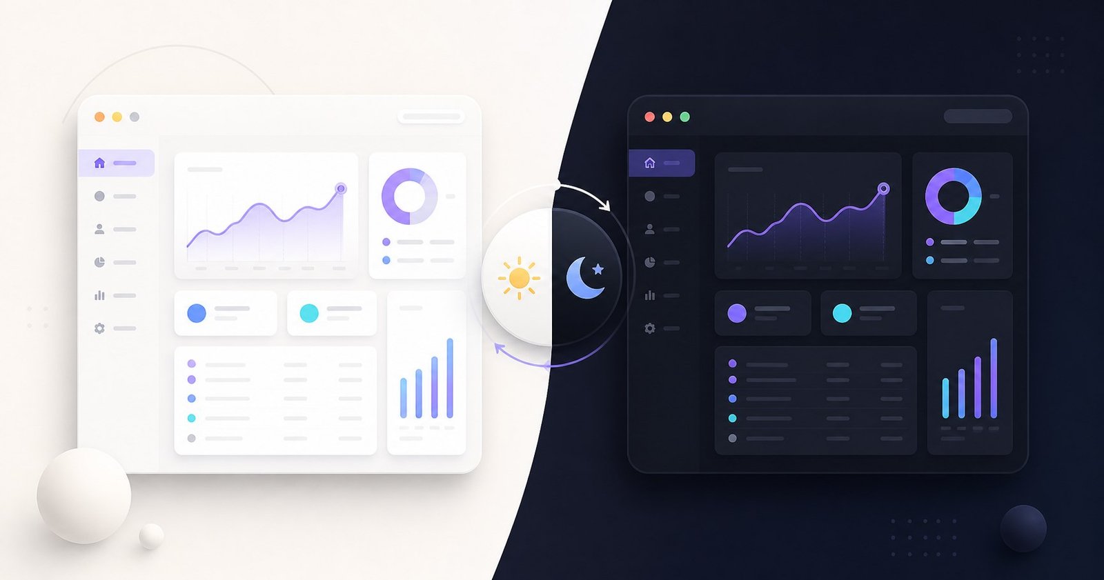
Dark mode is now an expected preference in many web applications. A good implementation does more than invert a few colors: it respects the operating system, remembers the user's selection, applies the correct theme before the page becomes visible, and gives keyboard and screen-reader users a clear control.
This guide builds that complete theme system with Next.js 16, TypeScript, Tailwind CSS v4, next-themes, and shadcn/ui. You will create a reusable provider and a menu that lets users choose Light, Dark, or System.
What you will build
- Light and dark color modes
- Automatic operating-system theme detection
- A preference saved across visits and synchronized across tabs
- An accessible theme menu built with shadcn/ui
- Hydration-safe rendering without an incorrect-theme flash in production
Prerequisites and project structure
Start with a Next.js 16 App Router project using TypeScript and Tailwind CSS v4. Use Node.js 20.9 or newer for Next.js 16. If shadcn/ui is not configured yet, initialize it before adding the components used by the toggle.
app/
  layout.tsx
  page.tsx
components/
  ui/
  theme-provider.tsx
  theme-toggle.tsx
public/
1. Install next-themes and shadcn/ui components
npm install next-themes
npx shadcn@latest init
npx shadcn@latest add button dropdown-menu
The button component becomes the menu trigger. The dropdown-menu component exposes all three theme choices without turning one icon into an ambiguous one-way action.
2. Create the ThemeProvider
The provider is a Client Component because it coordinates browser-only state. Passing through the library's component props keeps the wrapper reusable and type-safe.
"use client"

import * as React from "react"
import { ThemeProvider as NextThemesProvider } from "next-themes"

export function ThemeProvider({
  children,
  ...props
}: React.ComponentProps<typeof NextThemesProvider>) {
  return (
    <NextThemesProvider {...props}>
      {children}
    </NextThemesProvider>
  )
}
3. Wrap the root layout
Add the provider close to the root so every route can read and update the theme. The class attribute matches Tailwind's dark-mode selector. System is the default, and enableSystem keeps it responsive to operating-system changes.
import type { Metadata } from "next"
import { ThemeProvider } from "@/components/theme-provider"
import "./globals.css"

export const metadata: Metadata = {
  title: "Theme Demo",
  description: "Light and dark theme example",
}

export default function RootLayout({
  children,
}: Readonly<{ children: React.ReactNode }>) {
  return (
    <html lang="en" suppressHydrationWarning>
      <body>
        <ThemeProvider
          attribute="class"
          defaultTheme="system"
          enableSystem
          disableTransitionOnChange
        >
          {children}
        </ThemeProvider>
      </body>
    </html>
  )
}html element after reading the browser preference. The prop suppresses the expected one-level warning on that element; it should not be used to hide unrelated hydration bugs.4. Build an accessible ThemeToggle
The server cannot know which value is stored in the visitor's browser. Render a stable disabled placeholder until mount, then show the live menu. This avoids markup that depends on an unavailable server-side theme value.
"use client"

import * as React from "react"
import { Laptop, Moon, Sun } from "lucide-react"
import { useTheme } from "next-themes"
import { Button } from "@/components/ui/button"
import {
  DropdownMenu,
  DropdownMenuContent,
  DropdownMenuItem,
  DropdownMenuTrigger,
} from "@/components/ui/dropdown-menu"

export function ThemeToggle() {
  const [mounted, setMounted] = React.useState(false)
  const { theme, setTheme } = useTheme()

  React.useEffect(() => setMounted(true), [])

  if (!mounted) {
    return (
      <Button variant="outline" size="icon" disabled
        aria-label="Choose color theme" />
    )
  }

  return (
    <DropdownMenu>
      <DropdownMenuTrigger asChild>
        <Button variant="outline" size="icon"
          aria-label={`Choose color theme. Current: ${theme}`}>
          <Sun className="h-5 w-5 scale-100 dark:scale-0" />
          <Moon className="absolute h-5 w-5 scale-0 dark:scale-100" />
          <span className="sr-only">Choose color theme</span>
        </Button>
      </DropdownMenuTrigger>
      <DropdownMenuContent align="end">
        <DropdownMenuItem onClick={() => setTheme("light")}>
          <Sun className="mr-2 h-4 w-4" /> Light
        </DropdownMenuItem>
        <DropdownMenuItem onClick={() => setTheme("dark")}>
          <Moon className="mr-2 h-4 w-4" /> Dark
        </DropdownMenuItem>
        <DropdownMenuItem onClick={() => setTheme("system")}>
          <Laptop className="mr-2 h-4 w-4" /> System
        </DropdownMenuItem>
      </DropdownMenuContent>
    </DropdownMenu>
  )
}
The visible sun and moon communicate the resolved visual state, while the menu retains the actual choice—including System. The text alternative labels the action rather than merely naming the icon.
5. Add the toggle to a navbar
import Link from "next/link"
import { ThemeToggle } from "@/components/theme-toggle"

export function Navbar() {
  return (
    <header className="flex items-center justify-between border-b p-4">
      <Link href="/" className="font-semibold">My App</Link>
      <ThemeToggle />
    </header>
  )
}
6. Use theme-aware Tailwind classes
shadcn/ui uses semantic CSS variables such as background and foreground. Prefer those tokens so the whole interface follows the selected theme. Tailwind's dark: variant is useful when one element needs an explicit difference.
export default function Home() {
  return (
    <main className="min-h-screen bg-background text-foreground">
      <section className="mx-auto max-w-3xl px-6 py-24">
        <h1 className="text-4xl font-bold">Theme-ready interface</h1>
        <p className="mt-4 text-muted-foreground">
          This content follows light, dark, or system mode.
        </p>
        <div className="mt-8 rounded-xl border bg-card p-6
          shadow-sm dark:shadow-none">
          Semantic colors keep components consistent.
        </div>
      </section>
    </main>
  )
}
How the theme system works
- The ThemeProvider injects an early script and manages the class on
html. - It checks the saved
themevalue in local storage. - If the choice is System, it resolves
prefers-color-schemefrom the operating system. - Tailwind and shadcn/ui respond to the resulting light or dark class and variables.
- Calling
setThemeupdates the page, saves the preference, and synchronizes other open tabs.
Common mistakes
| Problem | Solution |
|---|---|
ThemeProvider is missing "use client" | Keep the directive at the top of the provider file. |
Only setTheme("dark") is offered | Provide Light, Dark, and System choices so the control is reversible. |
| Hydration mismatch appears in the toggle | Delay theme-dependent UI until mount and add suppressHydrationWarning to html. |
| Dark styles never appear | Pass attribute="class" and confirm the Tailwind/shadcn theme setup is present. |
| Icons have no accessible name | Add an action-oriented aria-label and screen-reader text. |
Best practices, performance, and accessibility
- Keep the ThemeProvider at the root and use one shared ThemeToggle.
- Use semantic theme tokens rather than repeating hard-coded light and dark colors.
- Test all three choices, refresh the page, and test across two browser tabs.
- Keep visible focus styles and verify the menu by keyboard.
- Check text, icons, borders, charts, syntax highlighting, form controls, and hover states for sufficient contrast in both modes.
- Respect reduced-motion preferences if you add custom theme animations.
- Do not read local storage during server rendering. Keep the theme interaction client-side and small.
Frequently asked questions
Does dark mode improve SEO?
Not directly. Dark mode primarily improves user choice and comfort. Search visibility still depends on useful content, crawlability, performance, and other technical signals.
Does next-themes remember the selected theme?
Yes. next-themes stores the selected theme in local storage and applies it again on future visits.
Can the website follow the operating system theme?
Yes. Set defaultTheme to system and enableSystem on ThemeProvider, then offer System as one of the theme menu choices.
Is shadcn/ui required for dark mode?
No. next-themes works independently of a component library. shadcn/ui provides accessible building blocks and theme-ready design tokens.
Why does the toggle wait until the component mounts?
The server cannot read local storage or the browser theme preference. Waiting until mount prevents server and client markup from disagreeing during hydration.
Official references
Final thoughts
A production-ready theme is a small system, not a single moon button. The provider applies and persists the preference, the root layout creates a hydration-safe boundary, semantic tokens carry the design across components, and an accessible menu leaves Light, Dark, and System under the user's control.
Once this foundation works, the next useful exercise is a responsive navigation bar that keeps the toggle reachable on both desktop and mobile screens. For more application fundamentals, continue with the Next.js 16 beginner guide or the App Router guide.
Need help with a Next.js interface?
NavTech Solution builds responsive, accessible, and maintainable React and Next.js experiences.
Discuss your project