

WHAT IS FLEXBOX ?
Flexbox, also known as Flexible Box Layout, is a layout module in CSS that allows developers to create flexible and responsive web designs. It provides an efficient way to lay out, align, and distribute space among elements within a container.
One of the main benefits of Flexbox is its ability to handle elements of varying sizes and dimensions. It allows developers to easily create flexible and responsive layouts that adapt to different screen sizes and orientations. This makes it a perfect solution for building responsive web designs.
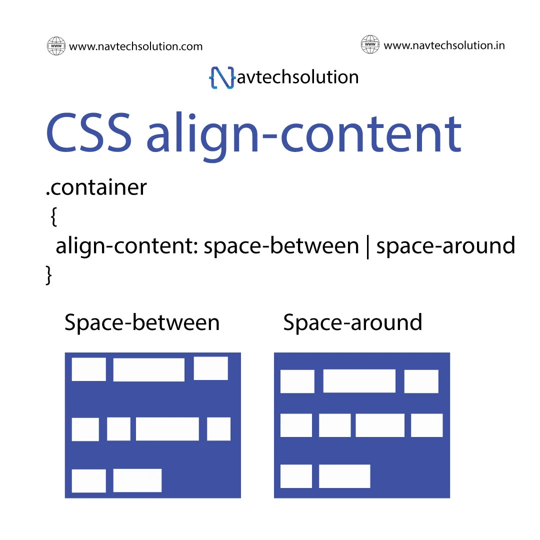
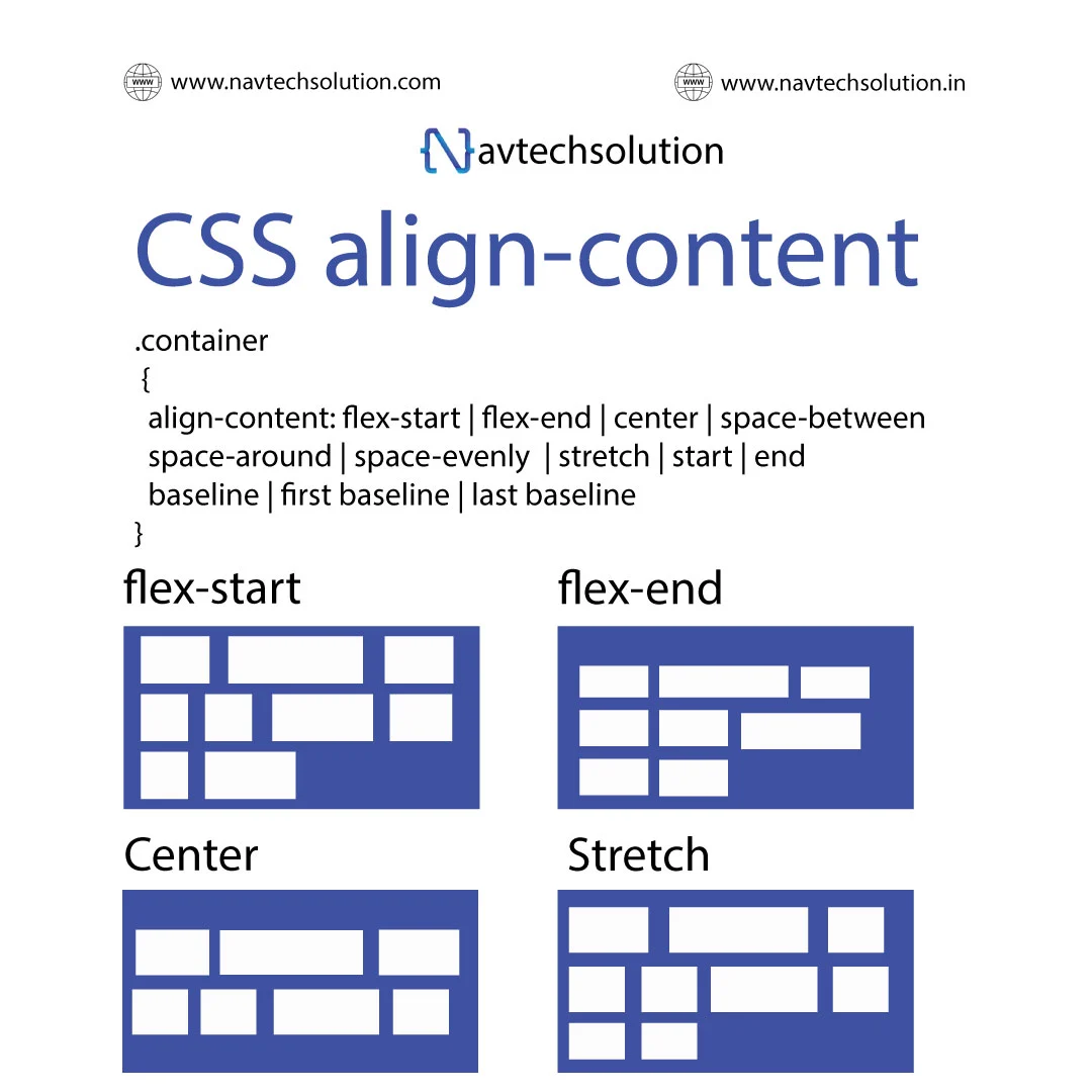
Flexbox also makes it easy to align elements both vertically and horizontally. It allows developers to control the alignment and distribution of elements, making it easy to create clean and consistent layouts.
Another great feature of Flexbox is its ability to handle complex web designs with ease. It allows developers to create nested elements that can be aligned and distributed within the container, making it easy to create complex layouts.
Table of contents
- Background
Flexbox (Flexible Box Layout) is a powerful layout module in CSS that makes it easier to design a responsive layout structure without using floats or positioning. It is particularly useful for aligning items within a container and distributing space within a container effectively.
Key Features of Flexbox:
- Main Axis and Cross Axis
- The main axis is the primary axis along which flex items are laid out (either horizontally or vertically).
- The cross axis runs perpendicular to the main axis.
- Flex Container:
- A parent element that holds the items and is defined by setting display: flex or display: inline-flex.
- Flex Items:
- Direct child elements of a flex container that are positioned and sized according to flex properties.
Basic Properties:
- display: Defines a flex container
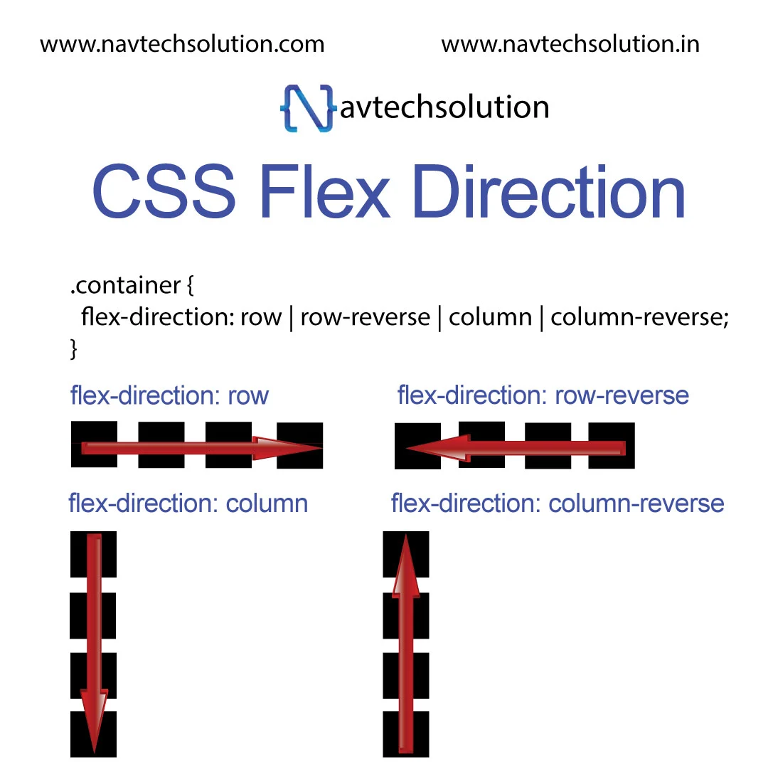
- flex-direction: Specifies the direction of the main axis (row, row-reverse, column, column-reverse).
- justify-content: Aligns flex items along the main axis (flex-start, center, space-between, space-around, space-evenly).
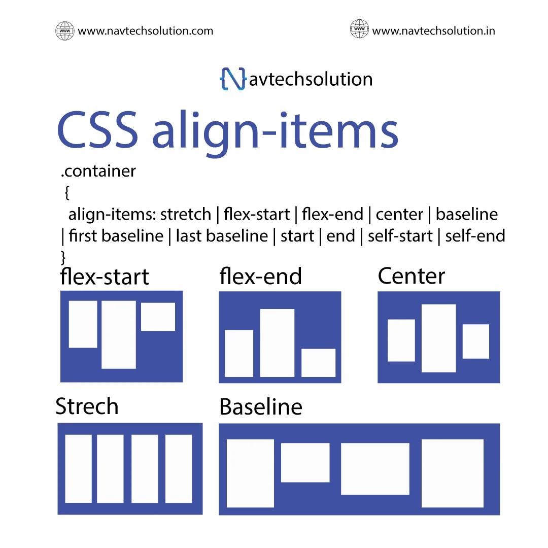
- align-items: Aligns items along the cross axis (stretch, center, flex-start, flex-end, baseline).
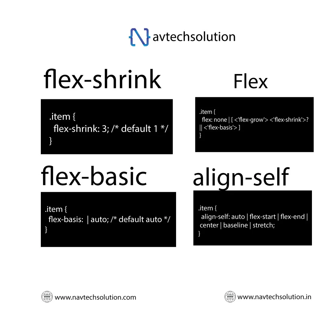
- align-self: Allows individual flex items to override the align-items property.
- flex-wrap: Specifies whether the flex container should wrap its items (nowrap, wrap, wrap-reverse).
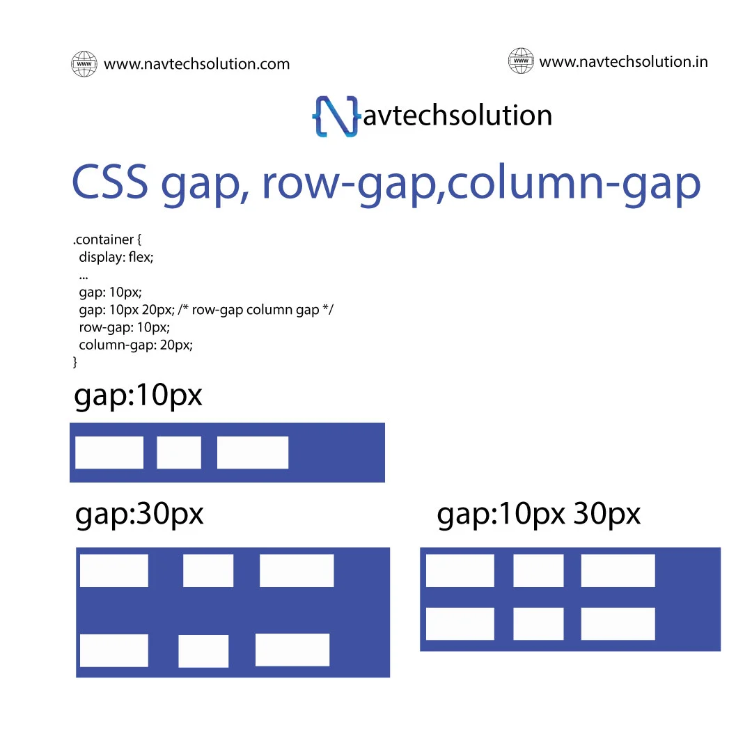
- gap: Specifies the spacing between flex items.
.container {
  flex-direction:  row | row-reverse | column | column-reverse ;
}